How a Software Interface Can Quietly Drain Your Budget
Uncover the hidden costs of poor software interfaces. Learn how bad design leads to wasted training, underused features, and long-term productivity loss — and how to avoid it.
11/2/20251 min read
When evaluating software, most buyers focus on features, integrations, and price. But there’s a quieter, often overlooked factor that can drain your budget long after the purchase: the interface.
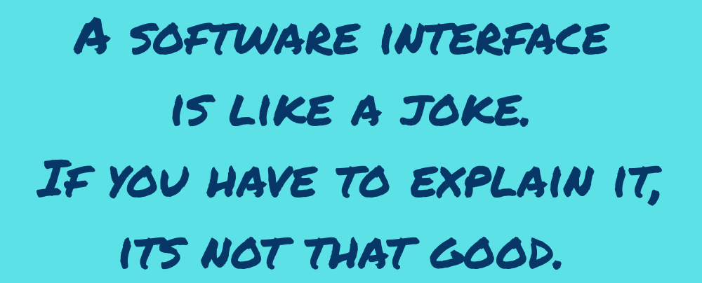
A poorly designed interface doesn’t just frustrate users — it costs you money. Every minute spent figuring out how to use a tool is time not spent solving problems or serving customers. Most vendors try to patch this with training programs. But training takes time, and every new employee who joins your team reintroduces that cost. It’s a recurring tax on productivity.
One common offender is the “toolbox” interface — a cluttered menu of features that overwhelms rather than guides. CRMs are notorious for this. They offer dozens of powerful tools, but bury them in complexity. The result? Features go undiscovered, underused, or ignored entirely. Users don’t know what’s possible without deep training — and even then, retention is spotty.
This isn’t just a usability issue. It’s a business risk. You’re paying for capabilities your team can’t access, and the ROI of your software drops with every unused feature.
What You Can Do
Avoid toolbox-style interfaces when possible. Look for software that guides users through workflows, not just menus.
Negotiate training into your service level agreement (SLA). Make sure ongoing onboarding and support are part of the deal — not just a one-time setup.
Test discoverability during demos. Ask vendors how users find and learn features without formal training.
Software should empower your team, not slow them down. If the interface gets in the way, it’s not just bad design — it’s bad business.


